Donor Scoring Isn't a Number — It's a Pattern You Can Read
By RaiseTell Team ·
When people hear "donor scoring," they picture a number — some formula that chews through a donor's history and spits out an 82 or a 34. That's the version most analytics tools sell, and it has a real problem: a bare number tells you where a donor stands, but not the shape of how they got there. An 82 could be a donor who's been rock-steady for a decade or one who cratered and clawed back. Same number, completely different stories.
RaiseTell scoring works differently, and the difference is the whole point. A score isn't a number you calculate. It's a short code you read — a compact string of letters that shows a donor's trend at a glance, the way you'd read a word.
Reading a score like a word
Here's what one looks like. Take a donor's giving-amount score:
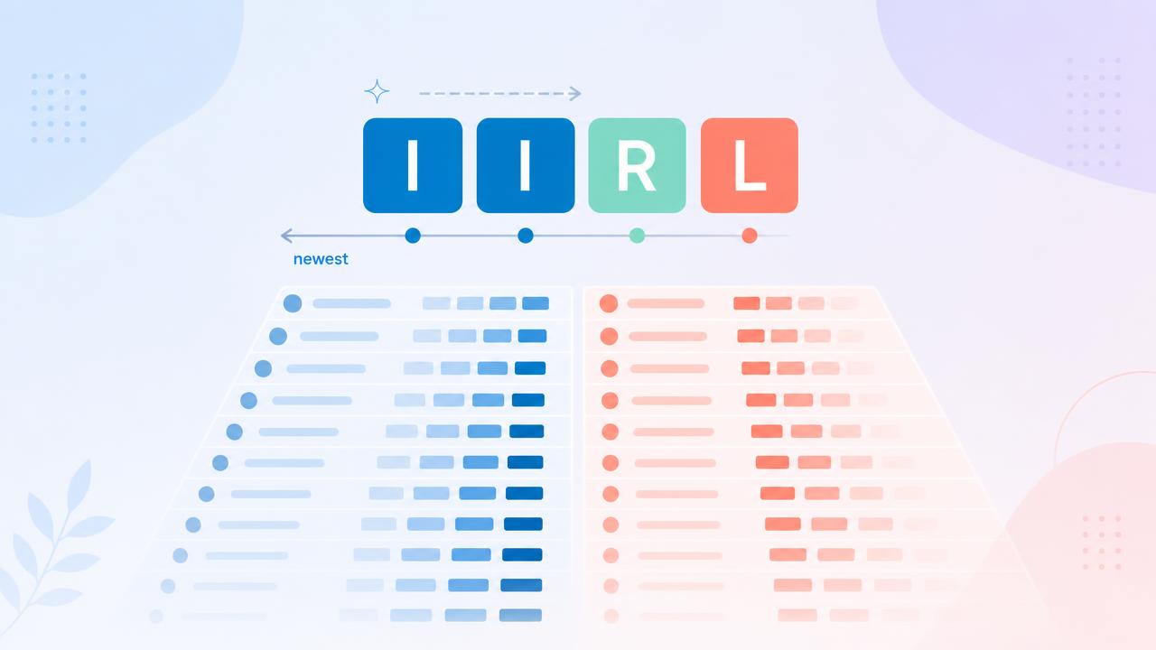
I I R L
You read it left to right, and the leftmost letter is the most recent year. So this donor's history, decoded, says: in the last year their giving increased, the year before that it increased again, three years back they were recaptured — they'd stopped and came back — and four years back they were lapsed. (They may have been lapsed even longer; the L just marks that they were lapsed at that point.)
That's a rich story — recovering, re-engaged, now climbing two years running — and you took it in at a glance, without opening a single gift record. The codes are simple: I for a year giving increased, D for a year it decreased, R for recaptured, L for lapsed. String them together and each donor's recent history becomes a little word you can read in a second.
Adding nuance without adding noise
A plain up-or-down letter is powerful, but sometimes you want to know how much. That's where qualifiers come in — small marks added to a letter to show magnitude. Illustratively:
I — giving increased 0–25% year over year I+ — increased 25–50% I++ — increased 50% or more
Decreases work the same way, with D, D-, and D--. Now a score doesn't just tell you a donor is trending up — it tells you they're trending up hard. An I++ donor who just doubled their giving is a very different conversation from an I donor who nudged up a little, and the code lets you see that distinction across your whole file without doing any math yourself. (The exact percentage bands are illustrative — the point is that the qualifier layers magnitude onto direction.)
The same lens, pointed at anything
Because scoring is a way of reading history rather than a single formula, you can point it at more than one dimension of behavior.
The most obvious is giving amount — the dollars, year over year, as above. But apply the exact same methodology to giving frequency — the number of gifts a donor makes in a year — and you get a second, equally telling story. A donor whose frequency is climbing is deepening their habit; one whose frequency is quietly falling may be cooling off even if their dollar total hasn't dropped yet. Read the amount code and the frequency code side by side and you get a fuller picture of how a donor actually feels about you than any single number could give.
That's the quiet power of a coded approach: it's a consistent grammar you can apply to any behavior you can track over time.
Why "at a glance" changes how you work
None of this would matter if you only had a dozen donors. The reason scoring earns its keep is that it makes thousands of donors legible at once — and, crucially, sortable.
Because every donor's trend is now a code, you can sort your whole file by it. Put every currently-increasing donor together. Put every decreasing donor together. Cluster the Rs who just came back, or the I++s who are surging. In a few clicks, a file no human could read top to bottom becomes a set of clean, meaningful groups — and each group implies a different message:
The increasers are ready for a thank-you and, for many, a next-rung ask. The decreasers need re-engagement before the slide becomes a lapse. The recaptured deserve a welcome-back that acknowledges the return. You're no longer guessing who belongs in which appeal — the scores hand you the segments.
This is the difference we keep coming back to. A report gives you the raw history — every gift, every date — and stops. An analytic reads that history and hands you the pattern: this donor is I I R L, that whole group is decreasing, here's who surged this year. One describes what happened; the other tells you what to do.
One honest note: a score is a reading of behavior, not a promise. It shows you direction and shape brilliantly, and that's usually exactly what you need to prioritize and segment — but for a major decision about a single donor, read the code and the relationship, not the code alone.
Making your whole file readable
This is exactly what RaiseTell is built to do. It reads the giving history you already have and expresses each donor's trend as a code you can read at a glance — amount and frequency, direction and magnitude — and because it refreshes as new gifts arrive, the codes stay current. Then you sort: increasers together, decreasers together, the surging and the slipping each in their own group, ready for the message that fits.
Your CRM already holds every gift. Scoring is what turns that history from something no one has time to read into something you can read like a word — and sort like a list.
Want to see your donors' trend codes?
RaiseTell reads your giving history and scores every donor as a code you can read at a glance — then lets you sort your whole file by it.
Book a Demo