The Revenue Waterfall Every Fundraiser Should Understand
By RaiseTell Team ·
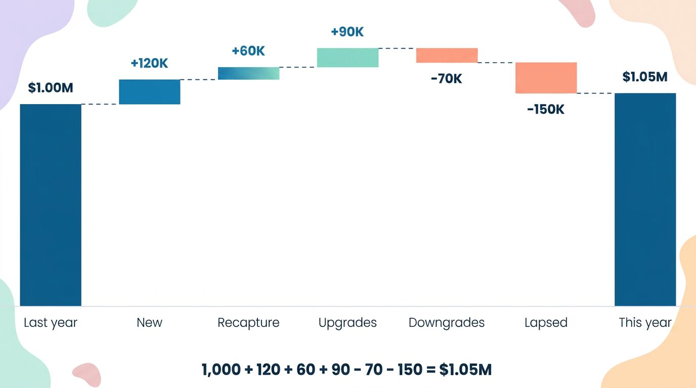
Here's a chart most fundraising teams have never built, and it might be the most useful one they could.
It's called a revenue waterfall — or a bridge chart — and it does something your annual total can't. Instead of telling you how much you raised, it shows you how you got there. It takes last year's number, stacks up everything that added revenue and everything that drained it, and lands on this year's number. The gaps in between are the real story of your fundraising.
Most teams never see that story, because they only ever look at the two endpoints.
The problem with a single number
Say your revenue went from $1,000,000 to $1,050,000. You grew 5%. The board nods, the report gets filed, and everyone moves on.
But "+5%" is a summary of a summary. It tells you the score and hides the entire game. Underneath that tidy 5% could be a healthy, growing donor base — or a base that's quietly hemorrhaging donors while a lucky handful of big gifts papers over the loss. From the topline, you genuinely cannot tell the difference. And those two organizations need completely different plans next year.
That's what the waterfall fixes. It breaks the one number into the handful of flows that actually produced it.
Building the bridge, step by step
Start with last year's total on the left. Call it $1,000,000. Then walk through what happened to it over the year:
+ New donors. First-time gifts from people who weren't giving last year. Say that's +$120,000. This is the flow acquisition feeds — necessary, but usually the most expensive dollar you'll raise.
+ Recaptured donors. Lapsed supporters who came back after a year or more away. Add +$60,000. These are people who already said yes once, which is why recapture tends to beat cold acquisition.
+ Upgrades. Existing donors who gave more than last year. Add +$90,000. Quiet, unglamorous, and often the cheapest growth in the building.
− Downgrades. Existing donors who gave less than last year. Subtract −$70,000. Rarely tracked, rarely noticed, and a direct drain on the topline.
− Lapsed donors. People who gave last year and didn't give at all this year. Subtract −$150,000. This is the leak in the bucket, and for most organizations it's the single biggest negative flow.
Add it all up: 1,000 + 120 + 60 + 90 − 70 − 150 = $1,050,000. The same +5% you started with — but now you can see exactly which currents pushed you up and which dragged you down.
What the bridge reveals that the total hides
Look again at that example. You netted +$50,000. But to get there, you actually gained $270,000 (new + recaptured + upgrades) and lost $220,000 (downgrades + lapsed). Your "5% growth" is really a story of enormous churn nearly cancelling itself out.
That changes everything about what you do next. If you closed the lapse and downgrade gap by even a third, you'd nearly double your growth — without finding a single new donor. If your new-donor flow is the only thing keeping you positive, you've got a retention problem dressed up as a good year. The net number would never have told you which.
This is also where last topic's leaky bucket gets a number on it. We said acquisition is the most expensive way to grow and that the warmest revenue is the donors you already have. The waterfall proves it on your own data: the up-steps from recapture and upgrades are usually cheaper and taller than they look, and the down-steps from lapse and downgrade are usually where your growth is quietly disappearing.
Why most teams never see their waterfall
Because none of these flows are sitting in your database waiting to be exported.
Your CRM stores gifts. It does not store "this donor gave less than last year," or "this donor came back after two years away," or "this gift is a first-time gift." Every one of those is a calculated comparison — this year against last, this donor against their own history. To build the waterfall by hand, someone has to classify every donor into new, retained, upgraded, downgraded, recaptured, or lapsed, across thousands of records, and redo it every time the data changes. That's a research project no development office has time for, which is exactly why the chart never gets built.
It's the same distinction worth repeating: a report tells you what happened; an analytic tells you what to do. A revenue total is a report. A revenue waterfall is an analytic — it doesn't just state the number, it points you at the specific flow to go fix.
Seeing your own waterfall
This is the kind of thing RaiseTell is built to calculate for you. It reads the donor file you already have, classifies every donor into the flows that make up your year, and shows you the bridge from last year's total to this one — new, recaptured, upgraded, downgraded, lapsed — without anyone hand-sorting a spreadsheet. You see at a glance which current is carrying you and which is draining you, and where the next dollar is most efficiently found.
And you don't have to stop at the chart. Behind every movement is the actual list of donors who made it up, so you can dig into any step — who lapsed, who upgraded, who quietly downgraded — and see exactly who's there. The whole waterfall is also broken down by segment, from your bottom donors through your top donors, so you can see what's happening at each level of your base rather than only in aggregate. The flow that's growing among major donors may be the one quietly collapsing among your grassroots, and the topline would never tell you.
Your total tells you whether you won. Your waterfall tells you why — and what to do about it before next year's number is already set.
See your own revenue waterfall
RaiseTell reads your donor file and builds the bridge from last year's total to this one — new, recaptured, upgraded, downgraded, and lapsed — automatically.
Book a Demo