Where Your Money Really Comes From: Your Concentration Numbers
By RaiseTell Team ·
Here's a question that decides more about your organization's stability than almost any other, and most teams can't answer it on the spot:
What share of your revenue comes from your top 1% of donors? Your top 5%? Your top 10%?
If you can't rattle those off, you're not unusual. Almost no one tracks them. But they're quietly running your organization whether you look at them or not — because in nearly every nonprofit, a small slice of donors provides most of the money.
These are your concentration numbers — not one figure but a short set, the share held by your top 1%, top 5%, and top 10%, plus how each is trending. Together they're the most important risk metric most teams never measure.
What concentration actually means
Picture your donors lined up from your smallest to your largest. A wide base of smaller donors, narrowing through the middle, up to a thin band of major donors at the very top.
Now look at where the dollars come from. In a typical file, it might break down something like this:
- Your top 1% of donors give around 40% of total revenue.
- Your top 5% give roughly 75%.
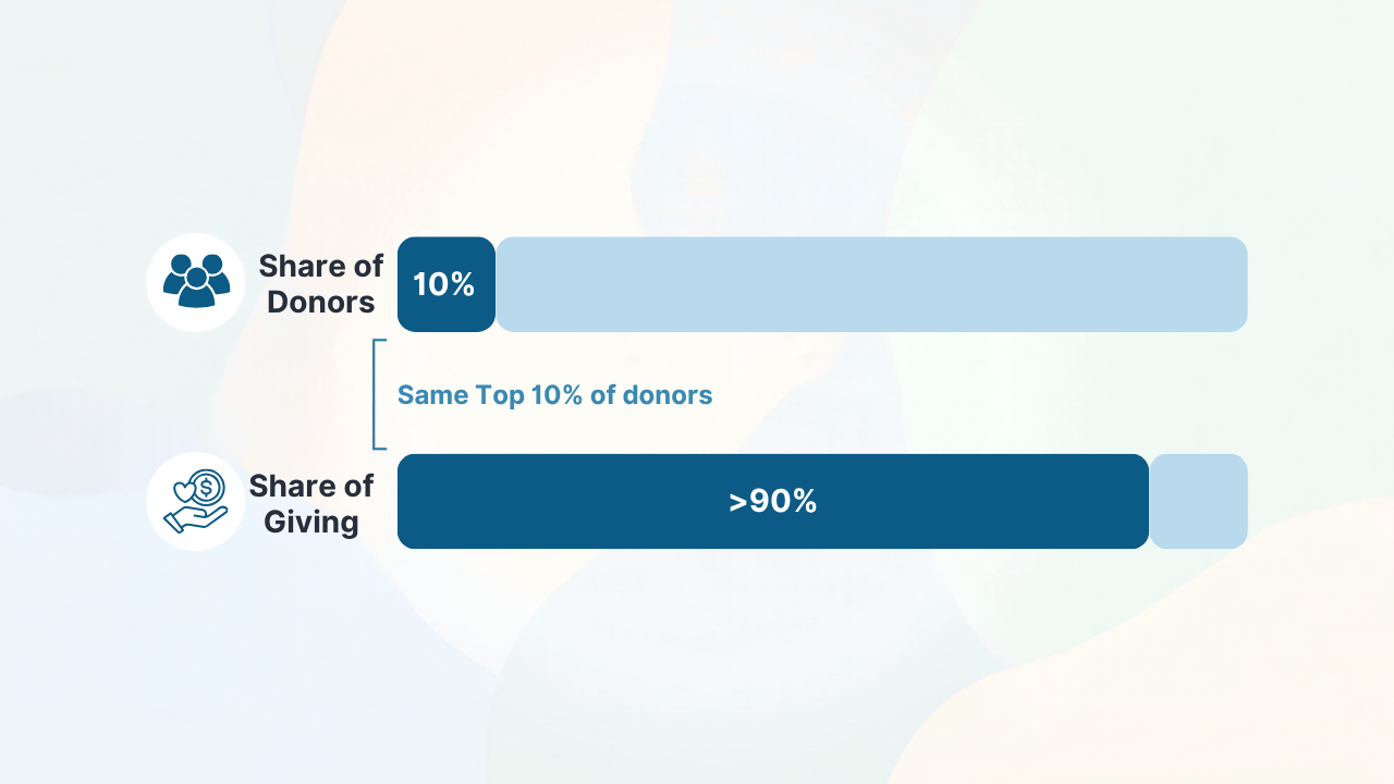
- Your top 10% — and this has crept higher in recent years — now give north of 90% at a large and growing number of organizations.
- Which leaves your bottom 50%, half of everyone on your file, providing just a few percent.
Those numbers aren't a problem in themselves. Concentration is normal, and to a point it's healthy: major donors are efficient, loyal, and worth every hour of stewardship. The problem is not having concentration. The problem is not knowing yours — because those same numbers are a precise measure of your risk.
Why the numbers matter
If your top 10% of donors fund more than 90% of your work, then the health of your entire organization rests on a few dozen relationships. That's tremendous leverage. It's also tremendous exposure.
Run the thought experiment. If two or three donors at the very top reduce their giving, delay a gift to next fiscal year, or pass away, what happens to your total? For a lot of organizations, the honest answer is: the year is blown, and no amount of grassroots activity can backfill it in time. The topline looked fine right up until it didn't.
Knowing these numbers turns that hidden exposure into something you can manage. A team that knows 40% of revenue rides on its top 1% stewards those relationships differently, forecasts more honestly, and builds a deliberate pipeline underneath them. A team that doesn't know is simply hoping the top holds.
The number you really want is the trend
A single snapshot of each is useful. The trend is where the insight is.
Is your concentration rising or falling year over year? Rising concentration — an ever-larger share riding on an ever-smaller group — means growing fragility, even in a year where total revenue is up. Falling concentration usually means your mid-level pipeline is doing its job and feeding the top.
This is also where your share of giving earns its keep as a tool rather than a trivia stat. A healthy donor base has a real middle: a band of mid-level donors being cultivated upward, replacing the major donors you'll inevitably lose to attrition. An unhealthy one is a spike — a few giants balanced on a hollow middle, with nothing in the pipeline to replace them. From the topline, the two look identical. By share of giving, they could not look more different.
Why you can't just look it up
Here's the catch, and it's the same one that hides every analytic worth having: none of these numbers are fields in your database.
To calculate them, someone has to rank every donor by giving, cumulate the totals from the top down, and work out what share the top 1%, 5%, and 10% represent — then redo it for each segment, and again next year to get the trend. That's not a report you can pull; it's a calculation across your entire file. Which is exactly why most teams have never seen their numbers, even though they're some of the most decision-relevant figures they own.
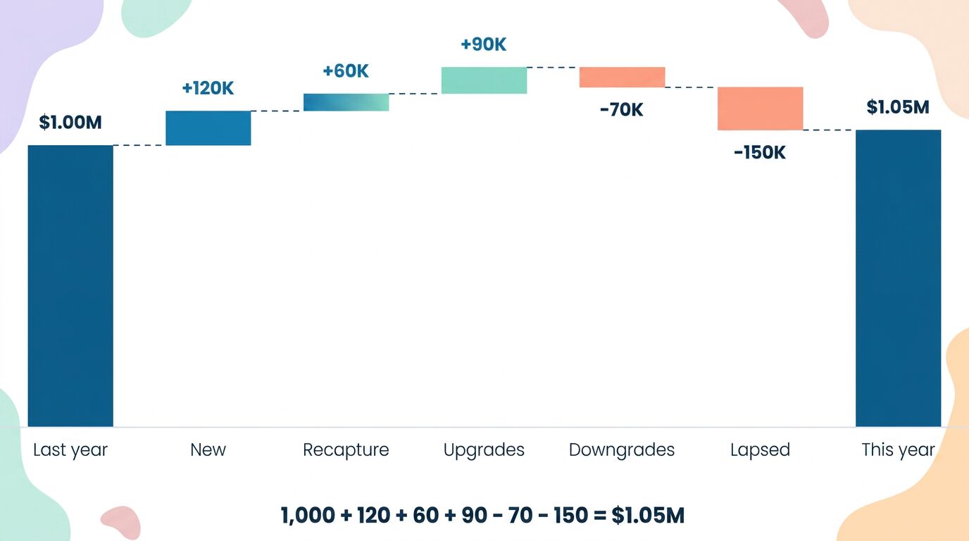
It's the distinction worth repeating: a report tells you what happened; an analytic tells you what to do. "We raised $1.05M" is a report. "40% of that rests on eleven donors, and your concentration is up six points in two years" is an analytic — it tells you precisely where to point your stewardship and your worry.
Seeing your share of giving clearly
This is the kind of thing RaiseTell calculates for you. It reads the donor file you already have, ranks and tiers your donors, and shows you exactly what share of giving each tier of your donors provides — your top 1%, 5%, 10%, and on down — along with how that concentration is trending over time. You can see at a glance how exposed you are, which relationships carry the year, and whether the middle of your donor base is strong enough to feed the top.
Your total tells you how much you raised. Your concentration numbers tell you how safely — and what to shore up before the year is riding on a phone call you didn't see coming.
Want to know your concentration numbers?
RaiseTell ranks and tiers your donors automatically, showing exactly what share of giving your top 1%, 5%, and 10% provide — and how that's trending.
Book a Demo